Planning Your First Website - Picking Your Colors
An important part of designing your first web site is choosing your colour palette. Color is a big part of any website´s overall message, image, and "feel". Your palette should match the mood.Color is a big part of any website´s overall message, image, and "feel". Color is one of the first things to hit people when they visit a particular site. Why not use this attention to give a great first impression?
A site made with blue shades is going to be perceived differently than one with predominant reds or yellows. Wise web designers learn basic color theory and apply the principles to their online creations. Of course, how someone perceives a certain color is open to individual interpretation. Depending on our personality, culture, perceptions, experiences, and so on - we may well assign different meanings to colors than another person would.
There do seem to be common meanings attributed to colors - ones that color therapists use in healing, in environmental planning and in design. Knowing these meanings can put you ahead of the game when choosing the ambience and mood for a particular website. Color is one of the first things to hit people when they visit a particular site. Why not use this attention to give a great first impression?
The
Institute of Color Research informs us that "research reveals all human beings make a subconscious judgement about a person, environment, or item within 90 seconds of initial viewing and that between 62% and 90% of that assessment is based on color alone."
Basic Color Theory
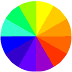
Color theory focuses on how color manifests on the spectrum. Color psychology goes one step further to assign common meaning or moods to specific colors. We can explore these by discovering the meaning of primary, secondary and tertiary colors - the most common colors used on the web.
Primary Colors
Primary colors are the three pigment colors that can not be mixed or formed by any combination of other colors. All other colors are derived from these three: red, blue and yellow. Each of these pure colors stir up different moods and feelings in a viewer.
Red - hot, fire, daring, lush, aggressive, power, excitement, dominating, warning
Blue - peaceful, water, calm, wisdom, trust, loyalty, dedication, productivity
Yellow - happy, sunny, cheerful, alert, concentration, bright, warm, creative, playful
Secondary Colors
Secondary colors are formed by mixing two of the primary colors together. These mixed colors also evoke particular moods.
Green (blue and yellow) - pastoral, spring, fertility, jealousy, novice, youth, hope, life, money
Orange (red and yellow) - warm, autumn, generous, strong, fruitful, appetizing
Purple (red and blue) - royal, mysterious, pride, luxury, wealth, sophistication
Tertiary Colors
Tertiary colors are formed by mixing the secondary colors with primary colors.
- Yellow-orange
- Red-orange
- Red-purple
- Blue-purple
- Blue-green
- Yellow-green
Of course there is also black and white, very common colors used in web design. Black is the absence of red, blue and green light while white is the purest saturation of all three. Black and white plus gray are known as non-chromatic hues.
Black represents style, dark, mystery, formal, powerful, authority.
White - clean, pure, chastity, innocence, cool, refreshing.
Analogous colors are any three colors which are side by side on a 12 part color wheel.
Complementary colors are any two colors which are directly opposite each other, such as red and green.
Making your Palette Seamless
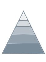
Colors are categorized into hues which when combined make up the color spectrum. Great web designers choose their main colors carefully, then combine variations of the hues throughout. As Christopher Schmitt explained "If you can carry a color scheme from the splash page to the exit tunnel, you´ll automatically create a cohesive look and feel for your sites". Sites that come off looking slick and well attended to incorporate color in deliberate ways. Matching the hues in background, titles, fonts, navigation tools and graphics is a big step towards a visually outstanding web environment. Changing the value of the hue used, combining a light value with a dark adds a sophisticated and harmonious look to a site. For instance, if you make a graphic with the RGB values of R=255, G=051, B=051, you can match this with a similar hex value for your text color, or #FF3333. Adding white to a particular hue changes its tint value; the addition of black changes the shade value. By carefully combining specific complementary colors in small doses to page areas that are intended to draw the viewer´s attention, a design can be easier to use and interesting to view.
Web-Safe Palette
Designers learn that out of the millions of possible hues, 216 are considered web safe.
Lynda Weinman exhibits these colors plus their html code number and RGB values in a nicely arranged chart cluster. Colors on the web are always a mixture of R (Red), G (Green) and B (Blue). The R or G or B value can range from 0 to 255. 0 meaning the color value (eg the R) is off and 255 meaning the value is fully on. Every screen color has a value that tells the designer how much of the R, G and B is showing or absent. In html, Red, Green and Blue values are written as six digit hexidecimal coding - a combination of numbers from 0 to 9 and letters from A to F. Pure blue has a hexidecimal value of 0000FF, and so on. To ensure that your colors look the way you intend them to, it is smart to stick to the web-safe palette of hues. This is because browser safe colors don´t dither. Dithering is what happens when a color is not available in the web palette, so the browser tries to compensate by combining pixels of other colors to substitute. Dithered colors look rough and spotty: browser-safe colors stay smooth and even looking.
Match Your Color to Your Intended Mood
If you want to wake up your audience - to initiate action or stimulate emotions, a warm color scheme works best. Reds, oranges, yellows all do the trick. If your intended mood is one of calm, leisure, dignified refinement - stick with the cooler colors - blues, purples, greens. If your statement is bold and to the point sharp contrasting colors work well - like black and white; blue and orange. Let your colors mean what you intend to convey. Your choice of colors speaks volumes - why not make it say what you want it to say?
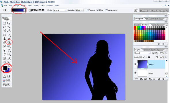
 . Now use the instrument
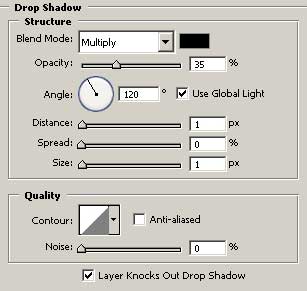
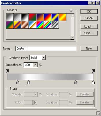
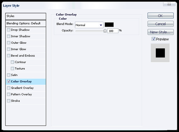
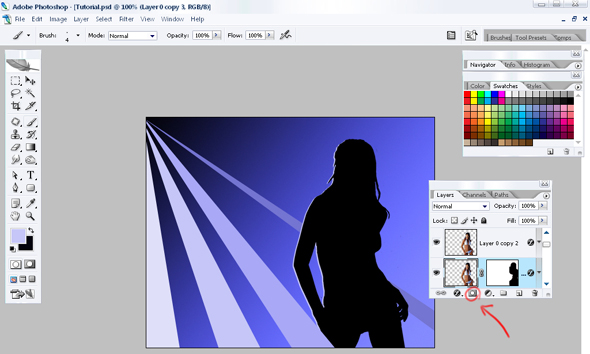
  to draw a grey short stripe. Set the adjustments in Blending Options, like it is demonstrated in the picture.



 again to represent a black figure , which bounds may be seen in the picture. Click on Blending Options, Stroke on the layer and choose the white color and 2 pcx.

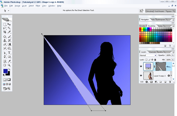
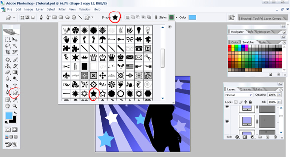
 and draw a white figure. Place it the way it is in the picture.


 to make a figure of white color. Use Free Transform to turn it on 45 degrees, like in the picture.



 In this example, the 2nd-level links (Warranties, Car preparation...) are still inferior to all the top-level links (HOME, ABOUT, CARS FOR SALE).


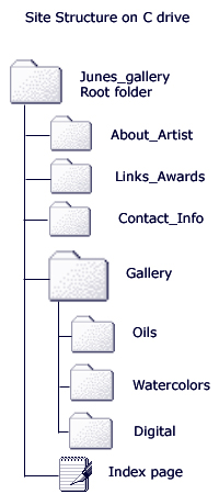 The best way to begin to develop your site structure is to make a prototype of the folders and pages that you will include on your site on your computer's hard drive. For instance, if your site is intended to showcase your art work, you might create a new folder on your C drive called Junes_gallery.








This is design company gpin.co.uk's homepage (75% scale). I find the excellent top image instantly appealing, but the page is really hard to work out, due to chaotic layout.
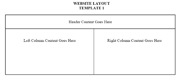
I think that one way to make this design far more useful would be to apply a simple grid-based layout.