27 tháng 11 2006

Planning Your First Website - Picking Your Colors

Planning Your First Website - Picking Your Colors

An important part of designing your first web site is choosing your colour palette. Color is a big part of any website´s overall message, image, and "feel". Your palette should match the mood.Color is a big part of any website´s overall message, image, and "feel". Color is one of the first things to hit people when they visit a particular site. Why not use this attention to give a great first impression?

A site made with blue shades is going to be perceived differently than one with predominant reds or yellows. Wise web designers learn basic color theory and apply the principles to their online creations. Of course, how someone perceives a certain color is open to individual interpretation. Depending on our personality, culture, perceptions, experiences, and so on - we may well assign different meanings to colors than another person would.

There do seem to be common meanings attributed to colors - ones that color therapists use in healing, in environmental planning and in design. Knowing these meanings can put you ahead of the game when choosing the ambience and mood for a particular website. Color is one of the first things to hit people when they visit a particular site. Why not use this attention to give a great first impression?
The Institute of Color Research informs us that "research reveals all human beings make a subconscious judgement about a person, environment, or item within 90 seconds of initial viewing and that between 62% and 90% of that assessment is based on color alone."

Basic Color Theory

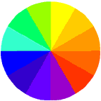
Color theory focuses on how color manifests on the spectrum. Color psychology goes one step further to assign common meaning or moods to specific colors. We can explore these by discovering the meaning of primary, secondary and tertiary colors - the most common colors used on the web.

Primary Colors

Primary colors are the three pigment colors that can not be mixed or formed by any combination of other colors. All other colors are derived from these three: red, blue and yellow. Each of these pure colors stir up different moods and feelings in a viewer.

Red - hot, fire, daring, lush, aggressive, power, excitement, dominating, warning

Blue - peaceful, water, calm, wisdom, trust, loyalty, dedication, productivity

Yellow - happy, sunny, cheerful, alert, concentration, bright, warm, creative, playful


Secondary Colors

Secondary colors are formed by mixing two of the primary colors together. These mixed colors also evoke particular moods.


Green (blue and yellow) - pastoral, spring, fertility, jealousy, novice, youth, hope, life, money

Orange (red and yellow) - warm, autumn, generous, strong, fruitful, appetizing

Purple (red and blue) - royal, mysterious, pride, luxury, wealth, sophistication

Tertiary Colors

Tertiary colors are formed by mixing the secondary colors with primary colors.

  • Yellow-orange
  • Red-orange
  • Red-purple
  • Blue-purple
  • Blue-green
  • Yellow-green


Of course there is also black and white, very common colors used in web design. Black is the absence of red, blue and green light while white is the purest saturation of all three. Black and white plus gray are known as non-chromatic hues.

Black represents style, dark, mystery, formal, powerful, authority.

White - clean, pure, chastity, innocence, cool, refreshing.

Analogous colors are any three colors which are side by side on a 12 part color wheel.

Complementary colors are any two colors which are directly opposite each other, such as red and green.

Making your Palette Seamless


Colors are categorized into hues which when combined make up the color spectrum. Great web designers choose their main colors carefully, then combine variations of the hues throughout. As Christopher Schmitt explained "If you can carry a color scheme from the splash page to the exit tunnel, you´ll automatically create a cohesive look and feel for your sites". Sites that come off looking slick and well attended to incorporate color in deliberate ways. Matching the hues in background, titles, fonts, navigation tools and graphics is a big step towards a visually outstanding web environment. Changing the value of the hue used, combining a light value with a dark adds a sophisticated and harmonious look to a site. For instance, if you make a graphic with the RGB values of R=255, G=051, B=051, you can match this with a similar hex value for your text color, or #FF3333. Adding white to a particular hue changes its tint value; the addition of black changes the shade value. By carefully combining specific complementary colors in small doses to page areas that are intended to draw the viewer´s attention, a design can be easier to use and interesting to view.

Web-Safe Palette

Designers learn that out of the millions of possible hues, 216 are considered web safe. Lynda Weinman exhibits these colors plus their html code number and RGB values in a nicely arranged chart cluster. Colors on the web are always a mixture of R (Red), G (Green) and B (Blue). The R or G or B value can range from 0 to 255. 0 meaning the color value (eg the R) is off and 255 meaning the value is fully on. Every screen color has a value that tells the designer how much of the R, G and B is showing or absent. In html, Red, Green and Blue values are written as six digit hexidecimal coding - a combination of numbers from 0 to 9 and letters from A to F. Pure blue has a hexidecimal value of 0000FF, and so on. To ensure that your colors look the way you intend them to, it is smart to stick to the web-safe palette of hues. This is because browser safe colors don´t dither. Dithering is what happens when a color is not available in the web palette, so the browser tries to compensate by combining pixels of other colors to substitute. Dithered colors look rough and spotty: browser-safe colors stay smooth and even looking.

Match Your Color to Your Intended Mood

If you want to wake up your audience - to initiate action or stimulate emotions, a warm color scheme works best. Reds, oranges, yellows all do the trick. If your intended mood is one of calm, leisure, dignified refinement - stick with the cooler colors - blues, purples, greens. If your statement is bold and to the point sharp contrasting colors work well - like black and white; blue and orange. Let your colors mean what you intend to convey. Your choice of colors speaks volumes - why not make it say what you want it to say?

Planning Your First Web Site - Your Site Layout

Planning Your First Web Site - Your Site Layout


Mountain Sprite Template Once you have decided on your site structure, genre, colors and sitemap, it is time to choose your web site layout. There are a variety of ways to physically create your layout, from coding the html yourself to using an html editor software program that codes the html for you. No matter how you decide to code your layout, the actual design of the layout needs to be determined. The best way to get an idea of the type of layout you wish for your site is to a) look at quality sites for an idea of how sites can be successfully laid out, and b) to take out a pen and paper and physically sketch the layout you are envisioning.

The most common ways to lay out a site for uniformity, aesthetics, and sheer symmetry include the use of a) frames b) invisible tables and c) cascading style sheets. Frames, though still used by some web designers are considered passe, and are generally discouraged. Cascading style sheets are a wonderful new way to code a site's layout separately in a special file, then plugging in the content within various other files. But, for your first site, I recommend working with invisible tables to provide a framework for your content while keeping the table hidden from your site visitors.

The first thing to consider is the dimensions of your layout. Unfortunately, people use different monitor display resolutions to view the web. A small percentage of people still use a resolution of 640 pixels wide, which means your site would have to be very tiny to be completely visible on their screens. The common default width of most people's monitors is 800 pixels, which is still quite small. 800 pixels is currently the standard smallest size of screen resolution to create a website. Thus, it is recommended that your site should look good at an 800 pixel wide by 600 pixel height so that these viewers do not need to scroll to the right to view part of your site. More and more, people use a resolution of 1024 pixels wide or more. You will want your site to look good to these viewers as well. One useful action to take to do this is to define your layout tables in percentages so that they will accommodate any width. For instance if a table is laid out at 100 % width, it will fit 100% of an 800 pixel wide screen just as well as a 1024 pixel wide one. It is also a good idea to center the main table so that it falls nicely in the middle of the screen, no matter what resolution is being used to view your site.

The second step is to choose the table configuration that you will use to create your layout. Below, you will find four common, quite easy to create table templates that can get you started in the right direction. Details for four layout table templates are discussed below - click on the link for each to download a pdf file of each template, complete with an image of the table being created as well as the basic html code for creating each one.

LAYOUT TEMPLATE 1:


As you can see from the diagram, template 1 consists of three main "cells" made up of one long Header row at the top, with two equal size larger content columns below. This design is excellent for a site that requires frequent side images, supplemented with text content. The top header part can contain the title of the site as well as the navigation titles or buttons.

Click Here to download a copy of Template 1 and the html code to create it.

LAYOUT TEMPLATE 2:


Template 2 is a much simpler design with only two "cells" including a thin side column and a much larger main content column. This design is simple yet effective for a site that houses large amounts of text and/or graphics. The side column is perfect for your navigation text links or buttons, while the main column can house your content.

Click Here to download a copy of Template 2 and the html code to create it.

LAYOUT TEMPLATE 3:


Template 3 is also a very simple yet tidy design with three identical "cells" made up of three uniform rows stacked on top of each other. When you first create the template, all three rows will look equal in width and height, but as you add your main content to the center row, the middle cell will become much larger than the smaller top and bottom rows. This design is quite elegant when your content is arranged with a header at the top, and your site information in the footer. You can put your navigation links or buttons either in the top or bottom rows (some people put it in both places, especially if the page scrolls down for a screen or two.)

Click Here to download a copy of Template 3 and the html code to create it.

LAYOUT TEMPLATE 4:


Template 4 is one of the most common layouts on the Internet. It consists of one long header row, with a second row beneath which is divided into three columns. The left side column is usually used for navigation titles or buttons, the right one for content highlights, announcements, ads, or small images, while the middle one is where the main content goes. The top row is usually used for headers, search boxes, small ads, and sometmes a second navigation access area.

Click Here to download a copy of Template 4 and the html code to create it.

Once you have your basic layout coded, you can move on to begin creating your navigation scheme, specifying your colors, and plugging in your content.

Learn Photoshop 03

hree girls posing in the night Illustration

Let's learn how to create an illiustration. You can get your favorite photo and try to do the same steps.

Let’s create a new document with dimensions 500x400 and 72 dpi. Using the instrument Pen tool Photoshop CS , create a triangle (colour code is indicated with red).
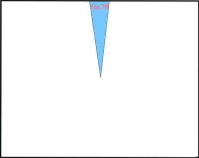
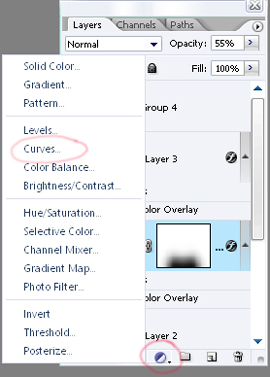
Create Three girls posing in the night Illustration in Photoshop CS

Continue using the same instrument Pen tool Photoshop CS and create triangles on all the backgrounds - one triangle to one background:

Create Three girls posing in the night Illustration in Photoshop CS

All of them having the same colour:

Create Three girls posing in the night Illustration in Photoshop CS

Continue create triangles:
We’ll get the next picture.

Create Three girls posing in the night Illustration in Photoshop CS


On a new background create a nice star using this instrument Photoshop CS2 Tool:

Create Three girls posing in the night Illustration in Photoshop CS

The colour code is indicated again with red.

Create Three girls posing in the night Illustration in Photoshop CS

Make several stars of different dimensions, but of the same color.

Create Three girls posing in the night Illustration in Photoshop CS

And several stars of different colors:

Create Three girls posing in the night Illustration in Photoshop CS

We’ll combine our stars with the triangles and we’ll have the next picture:

Create Three girls posing in the night Illustration in Photoshop CS

We’ll add some luminescent stars using the instrument Blending Options where we’ll choose Outer Glow and set out like in this picture:

Create Three girls posing in the night Illustration in Photoshop CS

We’ll get luminescent stars:

Create Three girls posing in the night Illustration in Photoshop CS

Add some extra-effects. We’ll use a big brush of white color on a new background and make the upper part of the picture brighter. The brush’s dimensions: hardness – 0% and opacity – 10%:

Create Three girls posing in the night Illustration in Photoshop CS

Also we’ll dark out the edges of the picture by clicking the next instrument and choosing Curves on a new background:

Create Three girls posing in the night Illustration in Photoshop CS

The menu is open and we can install the next parameters. Seizing the left point from the bottom.

Create Three girls posing in the night Illustration in Photoshop CS

If anything is done correctly we’ll see the next:

Create Three girls posing in the night Illustration in Photoshop CS

Let’s take the girl’s photo and using the instrument Pen tool Photoshop CS, move off the background:

Create Three girls posing in the night Illustration in Photoshop CS

Applying Blending options and parameter Colour Overlay on the girls’ background set out the black colour.

Create Three girls posing in the night Illustration in Photoshop CS

We’ll get the girls’ silhouettes:

Create Three girls posing in the night Illustration in Photoshop CS

Add the girls’ silhouettes to the result we got before and we’ll see:

Create Three girls posing in the night Illustration in Photoshop CS

Add also a shadow under the girls. We need to copy the background with girls’ silhouettes and use Free Transform (by clicking the right button of the mouse on the background) and display the silhouettes on 180* vertically. Don’t forget to change the opacity – 55% on the background.

Create Three girls posing in the night Illustration in Photoshop CS


Download: Source File

Learn Photoshop 01

This task we’ll learn to create a logotype for Music Records Company.

First create a new file 550x400 px and 72 dpi.
Draw a circle now, using the instrument 
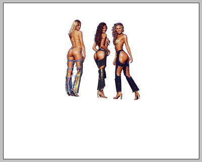
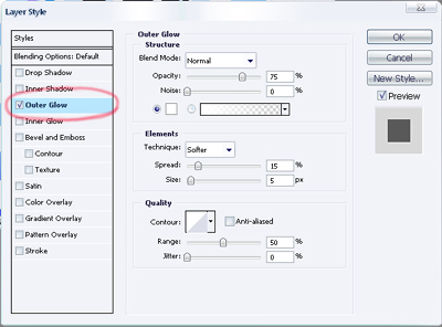
. The parameters should be the same from the picture.

Create Professional Logo for Music Records Company in Photoshop CS

Create Professional Logo for Music Records Company in Photoshop CS

Create Professional Logo for Music Records Company in Photoshop CS

Create Professional Logo for Music Records Company in Photoshop CS

Now make small circles inside the previous one with the same parameters form the picture.

Create Professional Logo for Music Records Company in Photoshop CS

Create Professional Logo for Music Records Company in Photoshop CS

In the Layers Window set Fill 0%. Use the function Free Transform to minimize the circles. The last circle has the same adjustments like in the picture.

Create Professional Logo for Music Records Company in Photoshop CS

The instrument 
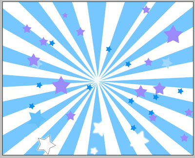
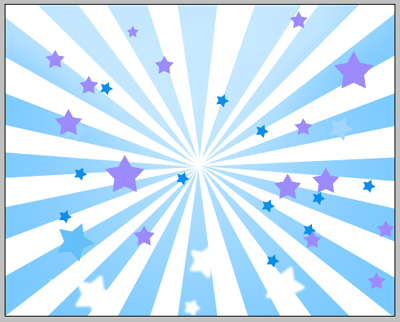
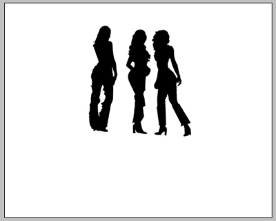
will help us to create figures like the next ones.

Create Professional Logo for Music Records Company in Photoshop CS

Parameters…

Create Professional Logo for Music Records Company in Photoshop CS

Use the same instrument to create a flame. The parameters are also indicated in the pictures.

Create Professional Logo for Music Records Company in Photoshop CS

Create Professional Logo for Music Records Company in Photoshop CS

Create Professional Logo for Music Records Company in Photoshop CS

Create Professional Logo for Music Records Company in Photoshop CS

Create Professional Logo for Music Records Company in Photoshop CS

Copy and turn it around horizontally, using Free Transform.

Create Professional Logo for Music Records Company in Photoshop CS

Add the text in the end with the instrument . The font should be Verdana.

Create Professional Logo for Music Records Company in Photoshop CS

The final result.