Colour
Colour is one of the designer's best tools.
There are lots of ways to use it to help communicate a message.
Colour can carry meaning, express personality, differentiate, frame, and highlight content.
Guidelines for using colour
Apply a colour scheme
Visually appealing web pages need a consistent colour scheme. Without colour, a page can lack personality. With a consistent and balanced colour scheme, a page can have a consistent and balanced personality. Too much colour, or erratic colour, gives a page a confused personality.
A colour scheme often refers to a consistent system of matching hues. It might alternatively mean a way of using colours, which don't necessarily belong to a family of hues.
For example, Apple.com uses different colours in different sections, but the colours are used in a similar way. In this case, the consistency derives from the treatment and application, rather than the colours themselves.
Example of not enough colour

Starbucks' home page is seriously lacking in a colour scheme.
Its grey background is inert and looks totally utilitarian. The brand is very much about lifestyle, as Starbucks' store design portrays, but the web site totally lacks any character.
Use enough colour
Using too little colour risks looking boring or inert. Colour is a good way of identifying, grouping or differentiating elements. It's cheap (especially when applied through Cascading Style Sheets) If you use too little colour, you have to use other means to draw the eye, to differentiate and give meaning to elements.
Leave white space
White is the best shade for reading text against. It is conventional to place have content areas against a white (or very light-coloured) background. White areas quickly stand out to the scanning eye as likely content areas.
Use your lightest background for main content
I'm going to stick my head out here and say it outright: white is the best colour/tone to put your central content on. The lightest tonal area on your page should be your content area, because that's conventional and what the brain expects.
Example
See http://www.pixelgraphix.de/. With the default stylesheet, the main text is displayed in very light grey boxes against a white background. Notice how your eye doesn't want to settle on the grey boxes - it wants to look at the white for some reason.
Original

Switched

The homepage for Irish broadband service provider HEAnet uses flat areas of white, but not for the content area. The content is against a not-quite-light-enough blue background colour. This makes it actually quite difficult to focus on the content.

Keep intense colours for attracting the eye
Intense colour attracts the eye, and the greater the area, the stronger the attraction. Too many intense colours attract the eye in too many directions, and the technique loses its potential effectiveness.
www.collegeclub.com uses a bit too much intense contrast and colour, which causes the eye to skip about.


The large area of intense orange in the middle of the page is the most attractive element, but doesn't contain high-value content. This is a design error.

www.guardian.co.uk also uses too many highly-attracting elements. The large number of bright red boxes confuses the eye, and the large number of heavy coloured boxes draws you away from the relatively light content in the middle of the page.

The web site of the RNIB (British organisation for the blind) is careful to employ sufficient contrasting tones to make all screen elements stand out sufficiently for people with moderate visual impairments.
The layout and colours fail in several ways.
The colour scheme is in disarray: The top-left logo area starts to use a good combination of greenish-blue tones. The rest of the page is dominated with a red hue, which does not sit with the blue.
Then, the strong yellow on the primary navigation bar adds a further primary colour. The problem is that primary colours don't go easily together.
The most intense, most contrasting, colour is the background to the secondary navigation bar. This attracts the eye first to a very low-value element, before even the site logo or any content.
Avoid juxtaposing intense flat colour with photographic imagery

This page for Harrah's Casino uses intense purple adjacent to a photographic montage. The intensity of the purple clashes with the subtle colours in the photographic imagery, making the colours seem dull and dirty.
Avoid using too many different colours
Lots of colour can look hyperactive or garish.
Some colours naturally go well together, some naturally clash, particularly when adjacent, which can create nasty effects on some screens.

This combination of colours clashes and is hard to read, also compounded by the tiny font.
Placing coloured areas adjacent to less-saturated or greyscale areas can look very smart.
Colour schemes inspired by Nature
Luke Wrobleski (in an article published on Boxes & Arrows) argues that so many corporate web sites use the same safe colour scheme that they're starting to look the same. He argues for more creative use of colour on web pages.
He says that, if we accept the benefits of working with layout conventions, and its inherent limitations, colour becomes a more useful and attractive way to differentiate designs.
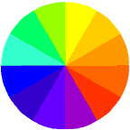
Luke also proposes a really nice way of finding complementary colour schemes: using inspiration from Nature.
Limitations of colour: Colour-blindness
Some people (mainly males) have impaired ability to tell certain colours apart. There are several types of colour-blindness, the most common affecting red & green (they appear very much the same).
The implication of this is: You should not use colour (particularly red and green) to mark elements in such a way that a user needs to differentiate the colours to use the interface successfully. The W3C Accessibility guidelines state the following as a Priority 1 checkpoint (i.e. you need to comply with this requirement to claim ANY W3CAG compliance):
- Ensure that all information conveyed with color is also available without color, for example from context or markup.
A second checkpoint states:
- Ensure that foreground and background color combinations provide sufficient contrast when viewed by someone having color deficits or when viewed on a black and white screen. [Priority 2 for images, Priority 3 for text].


 In this example, the 2nd-level links (Warranties, Car preparation...) are still inferior to all the top-level links (HOME, ABOUT, CARS FOR SALE).


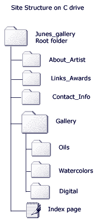 The best way to begin to develop your site structure is to make a prototype of the folders and pages that you will include on your site on your computer's hard drive. For instance, if your site is intended to showcase your art work, you might create a new folder on your C drive called Junes_gallery.

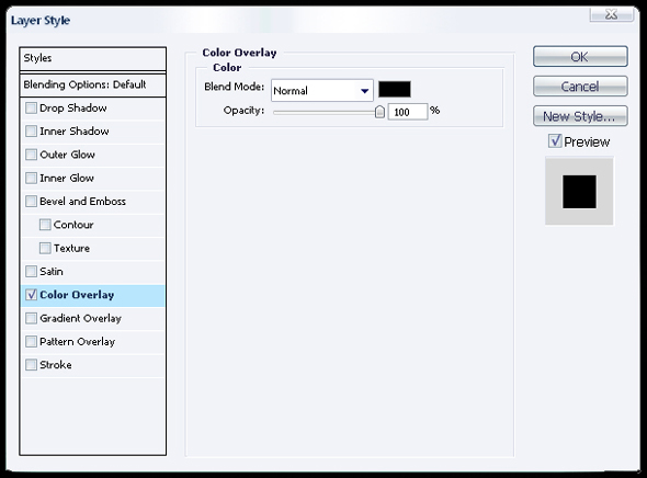

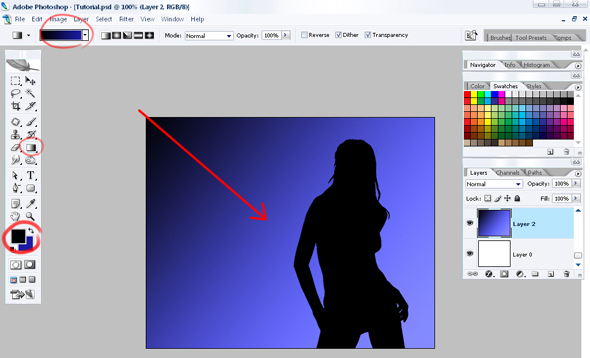
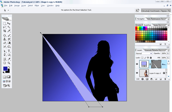



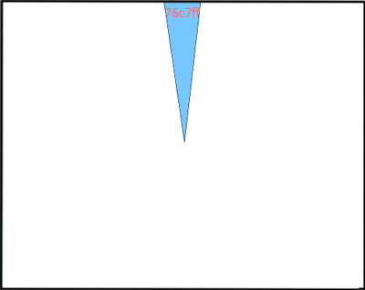
 , create a triangle (colour code is indicated with red).
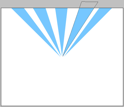


 :
:



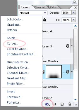
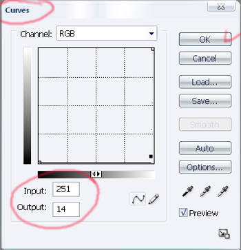

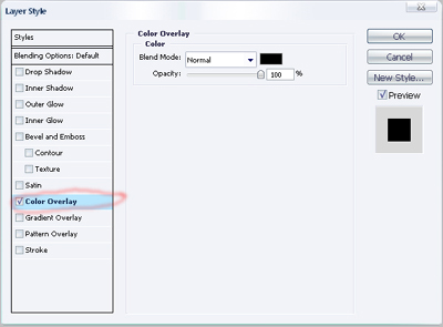
 , move off the background:


This is design company gpin.co.uk's homepage (75% scale). I find the excellent top image instantly appealing, but the page is really hard to work out, due to chaotic layout.
I think that one way to make this design far more useful would be to apply a simple grid-based layout.