27 tháng 11 2006

Web Page Layout 02

Designing Personal Web Page Layout
Take the instrument and make a small circle of white color and place it the same way it is done in the picture.

 Designing Personal Web Page Layout in Photoshop CS

Write the text now, applying the parameters below:

 Designing Personal Web Page Layout in Photoshop CS

Blending Options-Drop Shadow

 Designing Personal Web Page Layout in Photoshop CS

Blending Options-Gradient Overlay

 Designing Personal Web Page Layout in Photoshop CS

Gradient’s parameters

 Designing Personal Web Page Layout in Photoshop CS

Take the instrument to draw a figure of white color (holding on the Shift button, create intersecting themselves circles of different sizes, several times and you must get the same thing from the next picture).

 Designing Personal Web Page Layout in Photoshop CS

Copy the layer with the collected figure, looking like a button and place it the same way from the picture. Insert the changes (place the second half-circle inside, exactly like in the picture).

 Designing Personal Web Page Layout in Photoshop CS

Create on more button the same way we’ve created the button next to Personal Page words.

 Designing Personal Web Page Layout in Photoshop CS

And one more.

 Designing Personal Web Page Layout in Photoshop CS

Take a brush of small size and represent a pointer of white color (the corner is possible to create holding the Shift button, or point it, draw aside the brush on the necessary distance and holding Shift button click on the left mouse’s button on the place that is reserved for the line’s end).

 Designing Personal Web Page Layout in Photoshop CS

Web Page Layout 01

Designing Personal Web Page Layout
Create a new file having 766x606 px and 72 dpi. Color the layer in black, with the instrument 
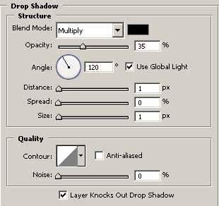
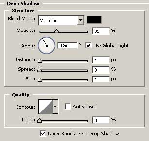
. Now use the instrument 
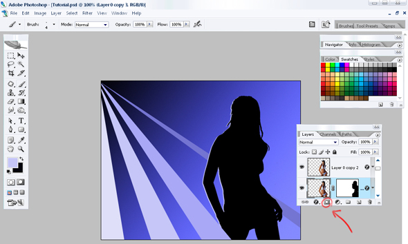
to draw a grey short stripe. Set the adjustments in Blending Options, like it is demonstrated in the picture.

 Designing Personal Web Page Layout in Photoshop CS

 Designing Personal Web Page Layout in Photoshop CS

 Designing Personal Web Page Layout in Photoshop CS

Copy the stripe then and turn it horizontally, using Free Transform option.

 Designing Personal Web Page Layout in Photoshop CS

Copy the lower stripe’s layer and place it the way it is done in the picture. Set out Opacity of 15%.

 Designing Personal Web Page Layout in Photoshop CS

Use the brush after that and make a circle with the color 707070. Erase a part of it to be exactly like in the picture.

 Designing Personal Web Page Layout in Photoshop CS

Use the instrument again to represent a black figure , which bounds may be seen in the picture. Click on Blending Options, Stroke on the layer and choose the white color and 2 pcx.

 Designing Personal Web Page Layout in Photoshop CS

Use the same instrument and draw a white figure. Place it the way it is in the picture.

 Designing Personal Web Page Layout in Photoshop CS

Copy the layer with the recently created figure. Turn it around using Free Transform and keeping pressed the Shift button, make it smaller, exactly like in the picture.

 Designing Personal Web Page Layout in Photoshop CS

Use the instrument 
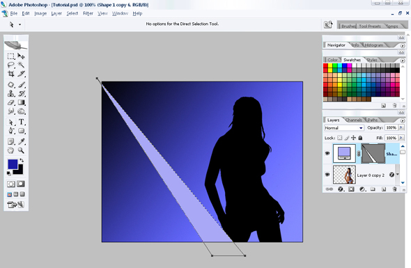
to make a figure of white color. Use Free Transform to turn it on 45 degrees, like in the picture.

 Designing Personal Web Page Layout in Photoshop CS

Colour

Colour

Colour is one of the designer's best tools.

There are lots of ways to use it to help communicate a message.

Colour can carry meaning, express personality, differentiate, frame, and highlight content.

Guidelines for using colour

Apply a colour scheme

Visually appealing web pages need a consistent colour scheme. Without colour, a page can lack personality. With a consistent and balanced colour scheme, a page can have a consistent and balanced personality. Too much colour, or erratic colour, gives a page a confused personality.

A colour scheme often refers to a consistent system of matching hues. It might alternatively mean a way of using colours, which don't necessarily belong to a family of hues.

For example, Apple.com uses different colours in different sections, but the colours are used in a similar way. In this case, the consistency derives from the treatment and application, rather than the colours themselves.

Example of not enough colour

Starbucks homepage

Starbucks' home page is seriously lacking in a colour scheme.

Its grey background is inert and looks totally utilitarian. The brand is very much about lifestyle, as Starbucks' store design portrays, but the web site totally lacks any character.

Use enough colour

Using too little colour risks looking boring or inert. Colour is a good way of identifying, grouping or differentiating elements. It's cheap (especially when applied through Cascading Style Sheets) If you use too little colour, you have to use other means to draw the eye, to differentiate and give meaning to elements.

Leave white space

White is the best shade for reading text against. It is conventional to place have content areas against a white (or very light-coloured) background. White areas quickly stand out to the scanning eye as likely content areas.

Use your lightest background for main content

I'm going to stick my head out here and say it outright: white is the best colour/tone to put your central content on. The lightest tonal area on your page should be your content area, because that's conventional and what the brain expects.

Example

See http://www.pixelgraphix.de/. With the default stylesheet, the main text is displayed in very light grey boxes against a white background. Notice how your eye doesn't want to settle on the grey boxes - it wants to look at the white for some reason.

Original

Grey boxes on white background

Switched

White boxes on slightly darker background is easier to read

The homepage for Irish broadband service provider HEAnet uses flat areas of white, but not for the content area. The content is against a not-quite-light-enough blue background colour. This makes it actually quite difficult to focus on the content.

HEAnet homepage

Keep intense colours for attracting the eye

Intense colour attracts the eye, and the greater the area, the stronger the attraction. Too many intense colours attract the eye in too many directions, and the technique loses its potential effectiveness.

www.collegeclub.com uses a bit too much intense contrast and colour, which causes the eye to skip about.

Screenshot of College Club home page Collegeclub.com home page snippet

The large area of intense orange in the middle of the page is the most attractive element, but doesn't contain high-value content. This is a design error.

Competing strong colours on Guardian's homepage

www.guardian.co.uk also uses too many highly-attracting elements. The large number of bright red boxes confuses the eye, and the large number of heavy coloured boxes draws you away from the relatively light content in the middle of the page.

RNIB home page

The web site of the RNIB (British organisation for the blind) is careful to employ sufficient contrasting tones to make all screen elements stand out sufficiently for people with moderate visual impairments.

The layout and colours fail in several ways.

The colour scheme is in disarray: The top-left logo area starts to use a good combination of greenish-blue tones. The rest of the page is dominated with a red hue, which does not sit with the blue.

Then, the strong yellow on the primary navigation bar adds a further primary colour. The problem is that primary colours don't go easily together.

The most intense, most contrasting, colour is the background to the secondary navigation bar. This attracts the eye first to a very low-value element, before even the site logo or any content.

Avoid juxtaposing intense flat colour with photographic imagery

Harrah's Casino, Las Vegas

This page for Harrah's Casino uses intense purple adjacent to a photographic montage. The intensity of the purple clashes with the subtle colours in the photographic imagery, making the colours seem dull and dirty.

Avoid using too many different colours

Lots of colour can look hyperactive or garish.

Some colours naturally go well together, some naturally clash, particularly when adjacent, which can create nasty effects on some screens.

Content box from 2advancedstudios

This combination of colours clashes and is hard to read, also compounded by the tiny font.

Placing coloured areas adjacent to less-saturated or greyscale areas can look very smart.

Colour schemes inspired by Nature

Luke Wrobleski (in an article published on Boxes & Arrows) argues that so many corporate web sites use the same safe colour scheme that they're starting to look the same. He argues for more creative use of colour on web pages.

He says that, if we accept the benefits of working with layout conventions, and its inherent limitations, colour becomes a more useful and attractive way to differentiate designs.

Luke also proposes a really nice way of finding complementary colour schemes: using inspiration from Nature.

So many sites look the same

Corporate sites looking the same
(HP, IBM, Dell, Microsoft) From Luke Wrobleski's article

Example of drawing a colour scheme from nature

A sample prairie-derived colour scheme.

From Luke Wrobleski's article

Example of drawing a colour scheme from Nature: Dublin, Ireland

A colour scheme drawn from the environment around Dublin.

From Luke Wrobleski's article

Limitations of colour: Colour-blindness

Some people (mainly males) have impaired ability to tell certain colours apart. There are several types of colour-blindness, the most common affecting red & green (they appear very much the same).

The implication of this is: You should not use colour (particularly red and green) to mark elements in such a way that a user needs to differentiate the colours to use the interface successfully. The W3C Accessibility guidelines state the following as a Priority 1 checkpoint (i.e. you need to comply with this requirement to claim ANY W3CAG compliance):

  • Ensure that all information conveyed with color is also available without color, for example from context or markup.

A second checkpoint states:

  • Ensure that foreground and background color combinations provide sufficient contrast when viewed by someone having color deficits or when viewed on a black and white screen. [Priority 2 for images, Priority 3 for text].

Alignment

Alignment

Alignment is another way of creating associations between visual elements, which help users quickly understand the relationships of objects on a page.

Alignment works by visually associating a number of elements. When you see a number of aligned elements, you instinctively believe that those elements are peers of each other, or share some other common property.

This is a really useful tool for quickly letting a user know what they're looking at by instantly spotting relationships between different elements.

Properties of alignment

Alignment works on any screen elements: paragraphs of text, images, buttons, pictures, links, even combinations of all of them.

Although aligned elements are often grouped spatially, they don't have to be. Alignment works across the entire screen, even when the axis is broken by another element. However, arranging elements in a line or grid is stronger because it also benefits from grouping.

Top-edge and left-edge alignment are stronger than right- or bottom-edge alignment, because of the natural flow of the cascade. Groups that are aligned by their left or top edges seem to be more important than they would be if right- or bottom-aligned.

Alignment axes that start near the origin (top-left of the screen) are superior to those that sit further right or further down. This is a useful way of indicating a visual hierarchy, particularly when you have too many elements to arrange into a neat cascade. See the first example screenshot below. Spot the top-level navigation links that are only associated by their alignment axis. The second-level links sit along an axis that starts further out from the origin. This makes them inferior to the first-level links - even if they were above some of the first-level links.

Example of alignment trumping cascade hierarchy In this example, the 2nd-level links (Warranties, Car preparation...) are still inferior to all the top-level links (HOME, ABOUT, CARS FOR SALE).

Although the L2 links are superior to the CARS FOR SALE link, it is associated with the higher first-level links by its alignment axis. Because that axis goes nearer the origin than the L2 link axis, all the elements that sit on it are superior to the members of the L2 axis.

Grids

Grids are a really useful tool for page design, and for forms especially. Once you find a design that seems to work because it uses strong and complimentary alignment axes, you can take the grid made by those axes and re-use them on other pages. Re-using layouts based on common (invisible) grids can strengthen a site's consistency.

Homepage of gpin.co.uk, needs a grid layout

This is design company gpin.co.uk's homepage (75% scale). I find the excellent top image instantly appealing, but the page is really hard to work out, due to chaotic layout.

I think that one way to make this design far more useful would be to apply a simple grid-based layout.

A simple example

In this example, there are four alignment axes at work:

Motor company site: alignment example
  • There are three top-level navigation links (Home, Cars for Sale, About)
  • "About" also contains a group of six other links. While they could arguably be viewed as either first- or second-level links, they are clearly distinguished by the fact that they attach to a separate invisible axis.
  • The text in the main body is all left-aligned, which clearly unifies the paragraphs.
  • The footer links are unified by top-aligning to the same horizontal axis.

The same image, with alignment axes marked

A more complex example

(Old Freeserve) marketplace mock
  • There are at least 10 alignment axes in effect on this page.
  • Note the 3 product ad panels towards the bottom. They have no common alignment, which suggests a weaker link than the 'Marketplace Areas', for example. In the absence of grouping by alignment or containment, they are associated by repeating a style.

Example of insufficient alignment

Screenshot (from ioxied) which lacks alignment
  • The main content boxes are not aligned, either by their left edges or top edges.
  • It's impossible to guess which of the boxes will contain the main content, which might contain secondary information, or which you would look at first.

Planning Your First Web Site - Your Site Structure

Planning Your First Web Site - Your Site Structure

Planning your first web site can seem like a daunting task, and in a way, it is. Careful and practical planning can make the job much easier - not to mention, more fun to boot! The second step in your design plan should be deciding your site structure. In the first step (Part I of this series) , you were advised to list the contents of your sitemap. This is critical, since it will lead you to decide on the structure for this listed content.

Site Structure is your Foundation

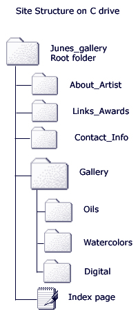
The best way to begin to develop your site structure is to make a prototype of the folders and pages that you will include on your site on your computer's hard drive. For instance, if your site is intended to showcase your art work, you might create a new folder on your C drive called Junes_gallery.

Using the image at the right as a guide, create a folder within the first folder (e.g. Junes_gallery) for each major section of your planned site. You can see in the image that there is a folder for About the Author, Links and Awards, a main Gallery folder with three individualized folders within the Gallery folder: Oils, Watercolors, and Digital Art, and the main Index page that is placed on its own within the the main site folder. This index page is the first page that anyone who visits your site will see. Within each of the folders and subfolders, you will place the individual pages, graphics, multimedia, sounds, Flash movies, .....whatever you decide to put on your site. It is VERY useful to create this sort of structure and place each graphic, page, etc. in the appropriate folder while you are working on the development of your site. This not only helps you be organized, it also facilitates previewing the site as you work on it, and in the final uploading of your work to your web hosting server. This sort of organized structure on your own computer also acts as a ready to access backup to your web site. It is not unheard of for a site to be damaged, hacked or for some other reason dumped from a system. If you have it stored on your computer, and especially if you work on any additions, revisions, or editing from those same folders over time,...you can instantly repair or even upload your entire site again within a few minutes using a reliable ftp (file transfer) program.

This first step should be followed, whether you are building your site by hand coding the html yourself, using an html editor like Dreamweaver or Coffee Cup, or even a built in html editor available on many web hosting servers. It is always a good idea to keep a copy of all of your coding in this computer based folder system, even if you use a free web service where you can use prefabricated templates, such as Geocities. It is not being paranoid to back everything up!

You may also wish to create a folder called Images to upload all of the images you use on the entire site in one uniform folder. Likewise, you might also want to store other similar files such as sound files, documents, newsletters, and so on in their own separate files. It is up to you. The key is to visualize how you want your site structured, and create the structure on your computer to set up a workable folder space to organize the various pages you will develop.

Once this is done, you can begin to work on your navigation, and deciding the name of and number of pages that will be included in each of the major sections. Part III will help you with these next steps.

Learn Photoshop 06

The girl at the disco


Begin with the fact that the dimensions of this new file will be 500x400 and a resolution of 72dpi. Now we’ll take the girl’s photo and cut out the background, using the instrument (Eraser tool).


Panic At The Disco Lyric House

Panic At The Disco Lyric House

Now in this file, with a click on the right button of the mouse choose Blending options. Choose Color Overlay and set out the black color. Now the girl became a silhouette.

Panic At The Disco Lyric House

We’ll transfer her in our new file, which we created at the beginning.

Panic At The Disco Lyric House

Choose the instrument Gradient tool and set out the colors, a dark-blue (Code 03030c) and alight-blue (code 1b1ca3). Then looking for the red pointer in the picture we’ll paint another background, which will be placed under the girl’s background.

Panic At The Disco Lyric House

Now we have to create the rays. Using the instrument Point tool we’ll set out 3 points, like it is done in the picture. Color code (a8a8f6). This ray will be situated above the girl.

Panic At The Disco Lyric House

The same way we’ll do the rest of the rays. The rays’ colors you may use from the picture.

Panic At The Disco Lyric House

Now it’s time to create the girl’s highlight. You should make it this way. We’ll double the girl’s background and give to the duplicate a color (code c6c6f7) and place it under the original one, move it to the left about a couple of millimeters. Now on this background we’ll create another one – a mask – background, like in the picture. Then we’ll chose the mask – background and using the black – color brush, we’ll delete the right side of the girl’s highlight. Like in the picture.

Panic At The Disco Lyric House

We’ll set out more rays and that’s what we got.

Panic At The Disco Lyric House

If you wish you may add more stars, using the instrument (Custom shape).

Panic At The Disco Lyric House

The final result:

Panic At The Disco Lyric House


Download:
Source File